Ideas to inspire your poster design!
Designing your own advertising poster? Or want to give your graphic designer a better brief/idea about the poster design you want? We hope the ideas and concepts covered here will help you create a great poster design...because great design equals great poster printing And with PosterBox as your online poster printer you can be assured your time spent designing will be rewarded by high quality, fast poster printing.
Communication is design
"Design is a way of organising something...There is no such thing as 'good design' or 'bad design'. The design is good if it does what you want it to do. It's bad if it doesn't" Bob Gil - Graphic Design as a Second Language
Before I begin designing a poster I always make sure I understand the purpose or goal of the poster. If a design looks great but fails to achieve its purpose then its bad design - sometimes a 'simple' design is more effective than 'cool' or 'funky' looking poster. Ask yourself:
- Am I advertising an upcoming sale or product or service?
- Am I educating or informing people? eg a sign.
- Who is it I want to see these posters?
- Where will the posters be displayed?
- How long might people have to see my poster?
- What do I want people viewing my posters to do?
By answering these questions you will give your poster design direction and clarity. For me the first step in design is to understand the product/service/message that the poster must communicate.

To view larger images and read about the designers of these posters please click: ChupaChupps - 'Jason' - Smoking - Drink Drive - VibeFit
PosterBox has not designed or printed any of the posters displayed above. All images are referenced and used only as examples of good design. If you would like further information about the designers please use the links provided which will take you to the source of the images.
Brainstorming!
Time to jump outside of the box! Brainstorming is fun! Pen and paper a must. Let your mind wonder, it will create ideas that you can develop further. Write down everything, do stick figures, doodles, stretch your imagination - think opposite, think sexy, think about the competition, do wordplay. There is no such thing as a bad idea when brainstorming. Search for inspiration in nature, magazines, the internet, anywhere. Let your mind wonder where it wants too and enjoy the journey
http://adsoftheworld.com/media/print/ford_do_knot
When brainstorming explore the advantages of the product/service/message? eg is it a solution to a problem? Could your design focus on a problem that the public recognises? This poster for Ford Germany highlights a common problem, that it is safe to assume, the public is familiar with - having numerous computer cables that get tangled. The poster is for Ford's Bluetooth capabilities! A clever solution to the problem - no more cables! Click on the picture for a larger view and background information on the design.
Explore other elements of your message
- Colour - red for hot, fast, scary. Blue for cool, calming etc
- Images - what images support my message? Scary or shock value images? Abstract, funny, simple...
- Play on words. Upside down - design it upside down? Do any of the words have a second meaning? eg knot - not
Break down the elements of your product/service/message and explore them all individually and as a whole. I am sure you will be surprised by where your mind takes you!
Headlines

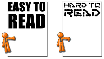
Since the average time spent looking at a posters is 30 seconds your message needs to be clear and concise. A big attention grabbing headline in a simple font is a good start. Most posters are read from a distance so make your headline big and clear. Try to avoid overly fancy fonts in your headings as they make reading posters hard from a distance. (and some fancy fonts can drive your poster printer bonkers due to bad font design)
Keep the amount of text/information on your posters to a minimum - a poster with one clear message is more likely to grab the viewer's interest than one with several competing messages. Make sure your contact information or your 'call to action' is easily found and understood. For example if you are designing a poster that is going to be viewed by moving traffic, having a small phone number is pointless as people won't be able to read it as they drive by.
Putting your headline on an angle or in reverse, ie white text on black background, adds an extra eye catching element. This can be particularly useful if you have an odd size image or a long headline. Get your headline jumping of your poster and you'll know your poster design is well on the way to being a winner.
Great Images and Graphics

Which poster GRABS your attention?
A picture says a thousand words....Good use of an image or images and graphics can make all the difference to your poster design.
Use images that reinforce the message. Think outside the square! 'What images support my message?' If you are designing a poster for a new mountain bike, while a picture of the bike might seem like a good choice, a picture of someone screaming down a mountain track with mud all over them would spark more interest.
The images/photos you use in your poster design need to be high quality. Images grabbed from web sites will print out very pixilated and you may be infringing on copyright. As a rule of thumb images should be a minimum of 150dpi at the size they are being printed. ie If your image is 300 dpi and you enlarge it on your poster by 300%, then the printing resolution of the image will be 100dpi. When scanning or purchasing an image it is certainly worthwhile to pay a little more to get an image than won't let your poster design down when its printed.
There are many stock image sites on the web where you can purchase images and graphics. When purchasing be sure you read the End User License Agreement (EULA), as you are not purchasing the image, you are, in most cases, purchasing the right to use the image(s) as described in the EULA. PosterBox uses Istock.
Test your design
Print a small version of your poster and show it around the office/shop and ask people if they 'get' what your poster is about. Get some opinions and make only the changes you agree with. Always make the sure changes you make achieve the purpose of your design, don't get side tracked in making changes that clutter your message.
"In the matter of layout forget art at the start and use horse-sense. The printing designer's whole duty is to make clear presentation of the message - to get the important statements forward and the minor parts placed so that they will not be overlooked. This calls for an exercise of common sense and a faculty for analysis rather than for art." William Addison Dwiggins - the father of the term graphic design.
By sharing our ideas, we hope that we have given you some inspiration for your poster design. When you have created your poster, please consider PosterBox as your online poster printing partner. We will transform your design in to high quality digital poster prints. You will find options for different media, complete instant prices that include overnight delivery and GST. Enjoy the PosterBox experience and the benefits of fast, high quality, poster printing.
A quick note on copyright
The advent of the computer and the internet have made the copying and inappropriate use of other people's work all that much easier. The printing industry is particularly sensitive to copyright as many aspects of the industry are susceptible to unwitting copyright infringements caused by customers supplying files for printing that use copyrighted material. When designing your posters it is your responsibility, and moral obligation, to take all possible steps to ensure the material you are using is not copyrighted or that you have permission to use the material. Copyright covers many aspects of the design process that you may not have considered:
- images - please don't use images you have 'grabbed' from websites or scanned from magazines or other sources. Stock images are very affordable so there is really no excuse for not using one of these services. If you are selling a product approach your supplier for an image of the product and ask if there are any restrictions on using the image(s).
- logos - other company logos, even those of products you are selling are copyrighted or may be trademarked. When using another company's logo make sure you have permission in writing. Many larger companies will have Style Guides stating how their logo must be treated - this is to ensure their branding is consistent.
- fonts - yes even fonts are copyrighted. There are thousands of free fonts on the web but again please be careful and read the EULA. Free fonts sometimes are not correctly designed and cause problems when printing. Supporting companies that produce fonts means we will continue to have available quality fonts that print correctly and look good.
Copyright can be a sensitive issue however it is not until our own worked is copied that we begin to appreciate the need for copyright protection. PosterBox provides this information as a general guide only and does not warrant that this information is correct.
For specfic information on copyright please visit:
- Australia's Copyright Council
- LetterHead Fonts
- PosterBox Terms and Conditions including copyright policy
